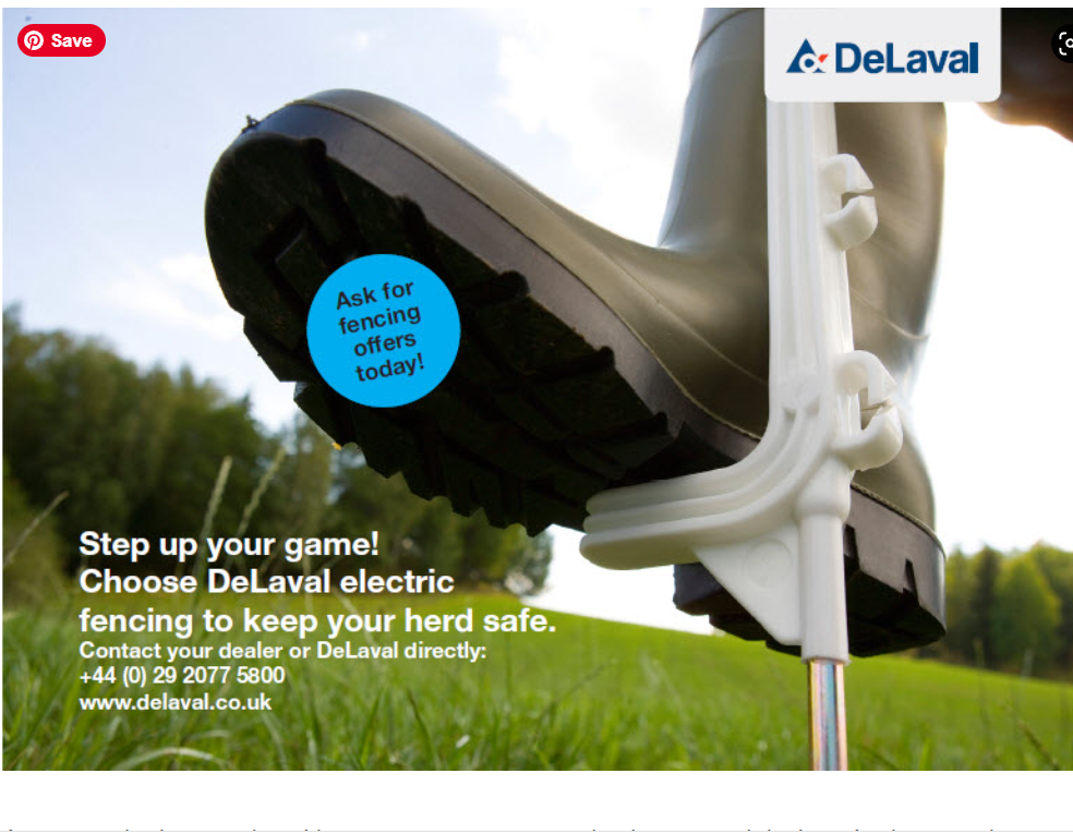
As a non-designer, when I have to create any marketing materials, I can’t always rely on some ad agency to help me with Photoshopping magical things together. I need to find great images (legally), write or adapt copy to fit that specific thing’s purpose and planned audience and make it look as good and be as enjoyable as possible myself. Being clear in a few words and creating emotions can be quite a challenge. And at the same time I had to stick to our branding elements like colours, fonts and logo box. Here I have done all copy and layouting and the fantastic image is from Björn Qvarfordt.


