Ideally all ads should grab attention, create interest and perhaps even motivate a person to take action. In reality I think most of us are pretty numb nowadays. Ad-blind. Hard to surprise and influence. Not many ads stand out but here are a couple that I am proud of.
Activity System Advert_APPROVEDI think this one is visually very nice and the agency who helped us create it found a great way to illustrate something that can’t be really seen. The product itself is a simple looking piece of hardware but what matters is the software inside and how it communicates with activity meters attached to cows who can be far away. I also like the strong title and a clear list of what it can do. And who doesn’t love animals and a summer feeling that it carries!?
Liner ad for UKThis one I created from scratch – found a nice illustration, wrote all the copy and aligned it with a bigger Plus campaign we had going on. We needed something more concrete than was available and chose three strong benefits together with the product manager to focus on. As we wanted to promote the whole range, I didn’t mention any product names, but followed all global branding guidelines.
DEL14-0010_Midiline_ML3100_Advert_A5_APPROVEDSometimes simple is the best. A nice, cleaned up photo and strong clear messages. Technically easy to produce and I could probably put together something like this myself but I was the production manager in this case.
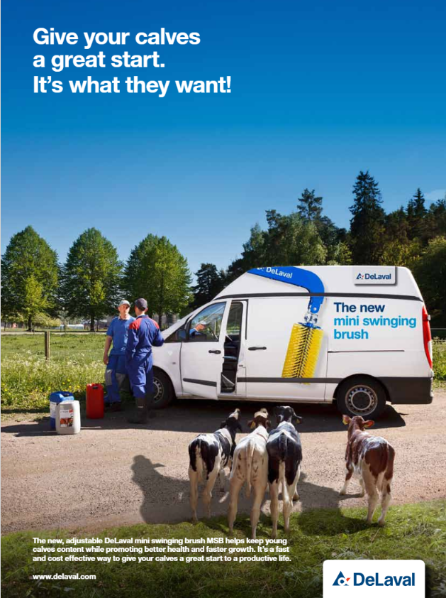
Mini_Swinging_Brush_MSB_Van_Advert_FINALAren’t calves the cutest? In a way this is an ad within an ad and it also shows the target group in an almost realistic looking situation. Our customers could easily relate to the situation where a DeLaval van drives up to their farm. If their animals go out to pasture and one happens to be close enough, you could actually see curious cows checking the van out. Also, since we already had a well known brush solution for full grown cows which looks identical to the newer calf version, we needed to find a way to explain proportion difference – that this version is smaller and suitable for smaller creatures.
EasyStride_Leaflet APPROVEDAgain a strong photo showing movement and a cute animal. Nothing is added by Photoshop. I know because I was there in the freezing cold farm, holding the flash during photoshoot. The message is more educational than just pushing the sales of a specific product as we wanted to raise awareness of a problem far more common than realized and other problems related to it while offering a solution – a new product on the market. And considering what kind of a rush we had with this launch, I’d say we did great.


