My role:
Strategic branding
Research
Copywriting
Brand platform development
Design system development
Brand guideline
The client
Our client had in mind a personal low budget philanthropic project of promoting the Good Life Goals (GLG) which are derivatives of UN’s Sustainable Development Goals (SDG) and should be easier to understand and act upon. He wanted to create something simple and modern that would work globally for a younger audience.
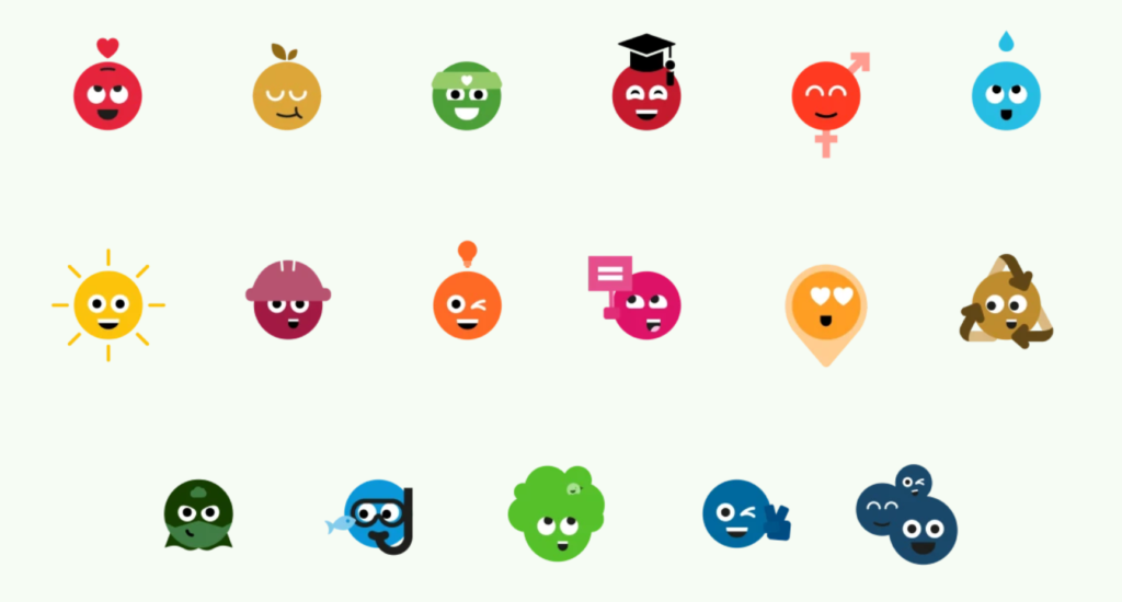
The core business idea was sending out daily push notifications for 17 weeks about the sustainability goals which ranged from simple ones like “Eat more vegetables” to something requiring more self-leadership and time like “Learn family finance skills” to quite complex like “Help boys and girls stay in school” and “Buy from companies that pay tax and treat people fairly”.
The client also envisioned an app as a nice to have and probably a website that would somehow elaborate on the topics. He was looking for help with creating design and content for his digital channels – a full package that he could hand over to an app/web developer – but our goal was to develop a visual identity for the client based on strategic insights.
Since this was a philanthropic hobby project that the client wants to almost single handedly make happen in his spare time with a very limited budget (a couple thousand Swedish Kronor per month with total cost of a family vacation equivalent), we tried to factor into all the deliverables the very limited time and financial resources so that technically he should be able to create his own branded material with free tools.
Legal, collaboration and differentiation
As Worldwise aims to communicate the Good Life Goals and the underlying UN’s Sustainable Development Goals we had to think about the legal framework as most of the content he wants to use is owned by other well known organisations and they have certain rules for how third parties can use their content. We made it clear for the client that he is responsible for ensuring compliance with laws and decided that we will work with the unchanged copy of Good Life Goals but not the visuals since the client didn’t like them nor did they seem to speak to the target audience.

We also wanted to help our client’s brand stand out a bit while still being clearly aligned with the connected strong brands but you can read more about that in the colours and shapes sections.
The research and task clarification phase
We spent quite a lot of time defining what is branding and what is not because with the very loose concept we got, it was really easy to wander into product development, business development, marketing and so on. We had to pull ourselves back many times because this was an interesting challenge but we wanted to focus on strategic branding – especially since we had very limited time.
We mapped out topics to research and focused on target audience and competitors though in our case, it was more allies since the organisations promoting the good life goals more or less all stand and fight for the same thing and are happy if others join their cause.
Target audience
The client wanted to focus on a global audience so the branding had to be very versatile. He wanted to start however with a younger audience and collaborate with schools in Sweden.
The Good Life Goals themselves are meant for a target audience who have at least secondary education while some of them might be a bit older, heavy consumers with disposable income. Therefore some goals focus purely on stopping over consumption.
We focused on 15-35 year olds or in other words – millennials and gen Z to narrow down a bit the younger audience our client wanted to reach though that too is a very wide audience – especially since he is hoping for a global reach.
Here are our main target audience findings:
- 15-35 years
- Tech-savvy heavy users of mobile devices
- Expect new, unique, fun, fast and educational
- Care about sustainability and societal values and take a stand for their beliefs
- Value brands that don’t just provide great products/services but to behave ethically, be transparent and also show what they care about
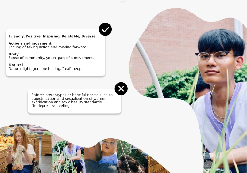
- Prefer authenticity over polished content and call out/boycott insincere brands
- Expect inclusivity and accessibility
- Are more easily convinced to make a change when they see clear benefits for themselves as well (if no-one litters, you can walk safely barefoot)
Ecosystem
After target audience research we looked also into other apps related to sustainability and saw some great existing products as well as examples of what not to do (incohesive looks, illegible, confusing etc)
Moving to creative phase
We started by prioritizing different branding elements together with the client and he expressed interest in photos, illustrations and animations and down prioritised logos, both graphic and sound.
Thereafter we presented several stylescapes to the client. He didn’t give very detailed feedback but liked using GLG colours as accent and flowy shapes. He also seemed to prefer simpler and cleaner designs and wanted to ensure relatability in photos.
We did also some research about accessible and globally available fonts and colour combinations and colour psychology which matched our target audience and started thinking about brand values though this is not necessarily something that should be part of a stylescape.
Creating a brand platform
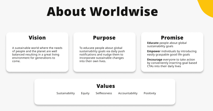
Since we really had to start creating visuals, we needed the brand platform. And since we had gotten very limited input from client, I used what I knew about his project, personal values and the background info we had on Good Life Goals to create for our client’s brand a vision, purpose, promise, values (which seemed really important to his target audience) and a key message and the client approved them as is.
Key message
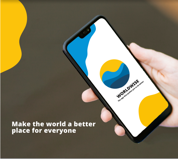
Make the world a better place for everyone
How?
Learn. Do. Help others
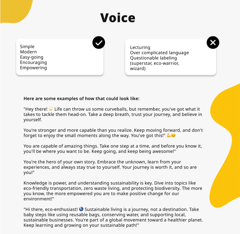
Voice
Creating a visual identity
Shapes
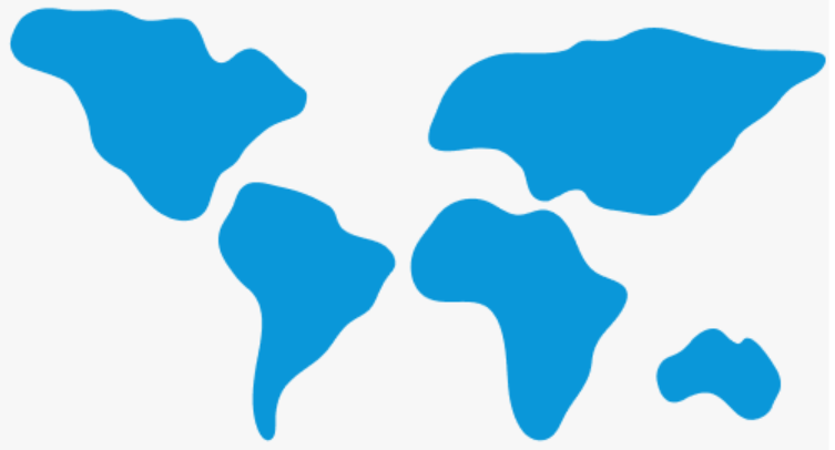
We knew we wanted to play with shapes to bring in the colours of the UN goals but not the original illustrations so that there would still be a connection but it would have its own look. Our client liked the idea too. We explored various shapes and decided quite quickly that we want to go for irregular shapes since diversity goes well with the topic of sustainability as well as inclusivity which was something that our target audience valued.
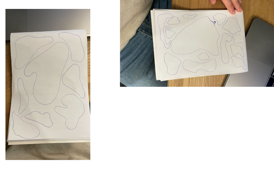
It took a while to find something versatile with a meaning. We knew we didn’t have time to create sophisticated illustrations and the client had also given us feedback that photos are more important than illustrations for them so we decided to use shapes for framing content in a simple way that offers lots of play room.
Once we came to the idea to use shapes of continents, it seemed to fit perfectly a brand that is focused on global sustainability. We began to create various versions inspired by continents to find the balance between recognisability and aesthetically pleasing look. Since we were using each continent separately we saw an opportunity to give them more realistic proportions in 2D than on world maps so that no part of the world would feel down-prioritized. We were also careful with creating shapes so they couldn’t be easily misinterpreted in some offensive way.
When it came to practical application, we saw that showing too much of shapes or just too many, created strange animal-like patterns. They also couldn’t be too detailed because that created a lot of noise and we wanted the content to be the center of attention. Our client loved the idea of continents when we pitched it to him so we kept polishing and testing and creating guidelines based on our learnings for how to create the desired look and feel.
Here are the final shapes:
Logo
We worked on logos based on one of his preferred stylescapes. These are the first versions:
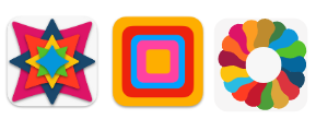
We decided to use the GLG and SDG colours and add our own custom black and white for the brand in logos. Adding any more colours felt like a bad idea. Client liked most the version on the right with flowy irregular shapes but wanted to reduce the number of colours and make more use of the global shapes. He also expressed that he doesn’t see the need for a logo and it could be as simple as the name spelled out.
Below are the new logo proposals based on client’s feedback. Three team members including me worked based on their interpretation of the client’s wishes so we could offer him diverse suggestions just like we did with stylescapes.
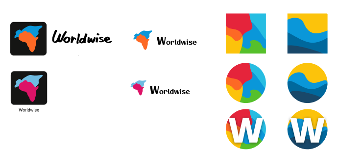
We played with irregular shapes and tested colour combinations for colour blindness.
I created the first ones that are showing the continents clearly and identifiably as the client liked continent shapes.
I used popping colours from the SDG colours to make it stand out and I had high hopes that the client would like them too because he told us about an old iPod campaign that used similar pop colours.
My personal preference is the one with magenta but I also made a version with bright orange because according to colour psychology it was supposed to be a great colour for younger people, conveying friendliness, happiness and energy which also match the brand.
I also worked on the text part a bit and used my actual handwriting which is vectorized and smoothed out a little bit to match the authentic and not overly polished feel that the target audience should appreciate according to our research.
I put the symbol on a black square with rounded edges because most likely the client will need something like that for an app icon and then he doesn’t need to go back to designers. I also think it helps the symbol pop even more without overcomplicating the logo.
When I tested both colour combinations then blue and pink kept their contrast despite the colour blindness type. The blue and orange melted basically into one on grayscale but with the black frame the symbol still looked quite nice. The colours looked quite muted in some other views though.

Client was impressed by our work.
Typeface
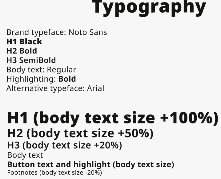
We really wanted this brand’s typeface to be widely accessible rather than very unique because it is carrying very important messages to a broad global audience. We ended up choosing Noto Sans family as the main typeface and Arial as alternative as they are both very common sans serif typefaces and should cover a wide variety of text tools and languages. We set clear universal rules for how different parts of text should look like as well as text layout and used proportions as guidelines so that the same logic could be used in many different locations.
Colours
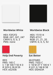
We decided to use the GLG and SDG colours as accent and add our own custom black and white for the brand and we did our best to ensure that the chosen colours could be applied online and offline without losing effect. Since SDG and GLG have dedicated colours for each focus topic, I added to the colour details the topic names so it would be easy for any future designer to know which colour to use with any specific piece of content. There is still a little playroom with brand’s own content but we aimed to limit the number of accent colours used to max 2 so it would complement the content instead of distracting.
Photos
Naming
Our client didn’t have a name yet for his project. He had one idea but was open to exploring other options. We started by mapping some relevant keywords and brainstorming for names. We got some feedback on those from our peer group who also belong to our brand’s target audience but we wanted to not influence too much the client in the first phase.
When we saw that the client seemed to struggle with making a choice for the name, we decided to conduct a survey among the target audience members in our network and went back to the client with a short list of names that got the most votes. He was still hesitant in making a final choice so we agreed to work with Worldwise for now. We all like the name but it is also used by other companies and some of them have applied for international trademarks. There is a risk of trademark infringement with at least one company’s business area as they produce software and also provide some education. There is also another company in the field of education that uses Worldwide. On the plus side, I researched the meanings of worldwise in different languages and nothing strange came up.
Brand style guide
Please see also the prototype of our brand style guide website (click on the play button on top right corner in Figma) which shows all the elements, usage rules and layout examples and contains the graphic elements, colours, fonts per text type etc. We decided to make sure that the brand will be very accessible by default, using appropriate font styles and sizes, alignments, white space and contrast.
The brand guide will be online so it could easily be updated and anyone needing to use it could always have access to the latest version. It will also be possible to make the graphical elements downloadable from the website so that all assets are in one place. The same goes for Figma so the client could just stick with the Figma prototype but it feels a bit less user friendly and has higher risks of someone accidentally changing something for everyone.
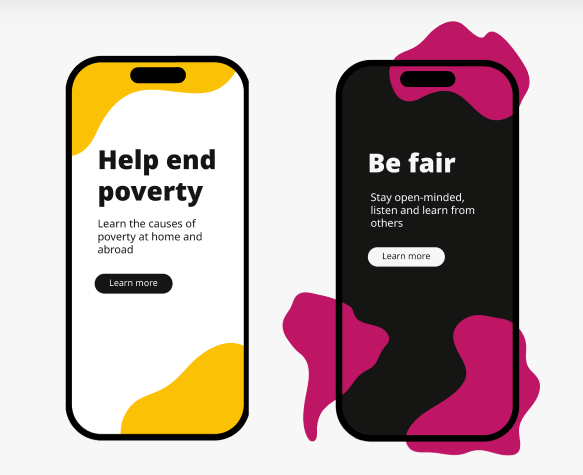
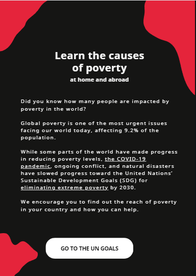
Here are just a few examples of the brand assets used according to the established rules:
