Today I want to talk about – you guessed it – how differently same things can be advertised from the whole concept to visuals. Advertising space in mass media is expensive so it is very important to first plan thoroughly what to advertise where, why and how.
Actually also targets for each ad or campaign should be set, but I’ll admit honestly, I haven’t found a great way yet to measure the usefulness of our ads as sales are influenced by many other factors as well and customers might come to us after engaging with us in various ways repeatedly.
Not always knowing how much we might gain, we can still do our best to assure that our ads look good, the messages are clear and the probability of the right people seeing them is high at the time when they might need the product/service advertised.
Enough of theory. I always feel that concrete examples make understanding things easier which is why I am sharing with you an ad made and published before my time and another that I made which is in media this week.
I don’t dare to say that my version is the best possible – most likely as I get more experienced, my views also change and next year even I myself might come up with something better (or afford professional agency help), but here is what I think of both:
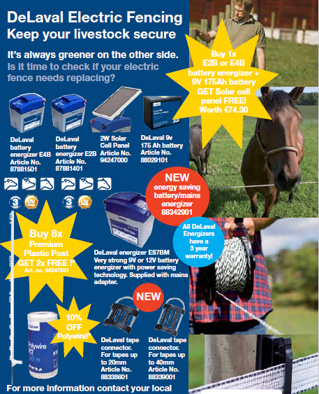
As you can see, the first example has a lot of different elements – colours, shapes, text and images. It is very detailed, including even article numbers of specific products. It is as if someone just used a page out of a really tacky catalogue and now all those elements are fighting for the magazine or newspaper reader’s attention. Notice me! I am big and yellow and pointy, they scream. Yet, the whole ad lacks focus.
The yellow stars are like something out of a 90s shop window discount ad while the visibility of white text on yellow background is one of the worst possible. There are also red and blue circles of different sizes and there is no way to tell if one of those is supposed to be more important than the others or if the sizes were chosen only based on the amount of text someone wanted to fit on the element.
The photos, on the other hand, are small and seem somewhat randomly chosen to show off some products. None of them give a good overview of the system nor seem they to strongly support products in the campaign. They might has well have been skipped all together if it was important to give a lot of product information. Without the “illustrative” images, there would have been more space and “air” between product units, allowing them to stand out more.
If we now look at the introduction then at least it is clear from the start what this ad is talking about – electric fencing. But then for some reason we seem to have three different slogan versions in a row.
“Keep your… secure” in itself seems like a pretty strong call to action. It highlights something about the reader and makes it personal. It also involves a strong verb and adverb. “Livestock” however seems to me not as the best choice of words. It is definitely a commonly used term, covering various animals, but I would have gone with something more… lively. Like “herd” or “animals”.
Next we have a cliche about grass being greener on the other side which doesn’t seem to be connected anyhow to what’s offered nor is it explained elsewhere. Where is this better place with greener grass then?
And then we have a third approach – a question. Questions in general are good, in my opinion. They make people think and attract interest. But this concrete question could have been phrased better. Why ask if it is time to check something? Here is a place to come from an authoritative position and just let the reader know that it is time to check their fencing supplies. A better question would have been something like: does your fencing need an upgrade? If we as the experts seem to already question whether it is worth to check something while we do want people to check, decide they need new stuff and choose to contact us, then why should they come to us? Especially after such a long line of steps in between. Does it make sense what I am trying to say?
Picking more on the same question, I would have chosen some other phrase than electric fence. Fencing involves a very wide assortment of products. There are all kinds of wires and posts and energizers and isolators and gate pieces and so on. Each of those might or might not need replacement. Currently to me it seems that the only likely broken or worn thing is the wire. Or on the contrary, the whole thing is in bad condition. Truth is often somewhere in between and the ad copy should factor it in, leaving room for flexibility and making the reader think through their equipment.
I could pick here on many other smaller details like the animal icons placed under some products but not all or warranty icon in three places (twice so small no-one can tell what it means).
I would argue that adding article numbers on an ad is a waste of space and it’s not a customer’s job to make a sales guy’s life that simple. A product name should be enough to inquire about something in most cases and sales stuff has an overview of campaign products anyway.
If I would have had a chance, I would have fought against using randomly capital letters in the beginning of some words.
And I would have screamed at the all over the place formatting of text paragraphs of which very few are aligned with each other.
As you might have guessed, the ad above was not at all my taste and I would have done many things differently. Some of those are very subjective. Some not. But if you are reading this and someone has given you an assignment to prepare an ad, you might want to pay attention to my criticism above. It might save you some money and reputation damage.
I have critiscised now quite harshly someone else’s work so I think it is only fair if you have a chance to critiscise mine as well (below). But first let me explain why I did what there.
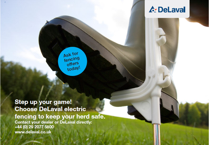
I am not a designer myself, but life has forced me to learn how to do the basics at least in Adobe InDesign. That is a very common layouting program that I work with. It lets me work with text boxes easily and add nice images. It also allows me to resize photos, pick which sections I show, flip them, add shadows and much more. Trust me, it is a great tool and life has forced me in the last months to use it daily again for all kinds of marketing materials from quarter page ads to catalogues to wall size banners. But back to this specific ad.
Mostly fencing is communicated with images of cows (or other animals) on a field surrounded by fencing. There is nothing wrong with that, but there is nothing new with that either and in an ad you want to stand out. So I was looking for a different visual.
My first idea was to play with some lightning symbols and safety signs, but before I could start looking for those or plan for purchasing something from picture banks, I decided to take a look at our own image bank and after scrolling up and down fencing related images I finally noticed something different. An angle not so common, yet an image that impressed me. Hopefully it will impress you and others as well.
I liked that the image itself remains a bit mysterious and without reading the text, it is far from obvious what is advertised. Perhaps you don’t think this is a good tactic. I am counting on curiosity.
So I found a low angle image of a guy’s rubber booted leg pressing a fencing pole into the ground. Did you guess it?
I wanted the ad to look nice and clean, have focus and get quickly to the point. I also love word plays if they are used well. In this case, “Step up your game” came to me within minutes, I think. As the other ad, this one too is turning directly to the reader with the “your game”. And “step up”, because it’s not a very common phrase and the picture is a boot. “Up” because our company offers premium products.
The following call to action is very much straight to the point. Buy X from Y for Z. There is another more specific call to action which actually introduces a way to call someone. The previous ad had also contact info which I cropped. Adding contact info is no new invention, but research says that actually asking people to call or write etc makes more people do that.
About the web address, I hear there are different opinions about whether it should be a specific web address taking a customer to a product/campaign page or just the main address. Usually, when possible, I believe in adding simple but specific addresses. This time I didn’t as the web is about to be completely rebuilt and I thought that a generic link is better than a soon broken one.
There is actually also a third call to action that asks for attention in a special blue bubble which mentions quickly that there are special offers available for fencing. At first I even wrote “special”, but highlighting fencing area there as well seemed more important and I didn’t want to overdo it.
Every word in that ad is thought through. Every element is carefully aligned to work together with the image well and assist people in deciding what is important even if they just spend a second or two screening the ad. There is lots of empty space to create harmony between the important info and the background (noise). And though the ad stays on a very high level, everyone should get the point. And no rocket science was needed to make it.
Which one do you like best and why?

